The Chinese New Year e-greeting for Hong Kong based client Contract Dispute Consultants features this year's animal, the Rooster.
Saturday, 28 January 2017
Kung Hei Fat Choi!
Tuesday, 6 December 2016
Careers in Engineering Campaign 2016
Always nice to see the placement of an advert in the final publication in which it appears. On this occasion, for client WISE, I landed lucky – front page (albeit at the bottom) of this recent accompanying supplement to The Independent.
Thursday, 1 December 2016
Cycles Of Eternity
Aldred Design has recently completed the layout and visual design for a new book, Cycles of Eternity, that deals with the esoteric subject of Theosophy and The Ageless Wisdom. Working closely with the author, Tim Wyatt, the visual look of the 112-page perfect bound book was developed over the course of almost a year, to produce a document that is both engagingly written and richly illustrated and intended to be much more accessible in its presentation of material that, in the past, has often been dealt with in a rather dry and undigestible manner.
The book is available from Firewheel Books of Bingley.
The book is available from Firewheel Books of Bingley.
Friday, 25 November 2016
Lettings and tenant services pack
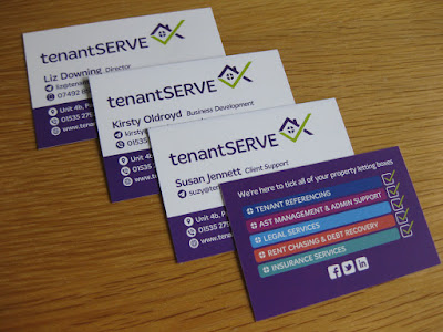
A new identity and company literature pack has recently been completed for client, tenantSERVE.
As part of an overall review of its visual image and sales literature, tenantSERVE's existing identity was redrawn and refreshed, using a new font, to create a stronger and 'friendlier' brand image for the company.
An A5-size carrier wallet, containing five insert leaflets (each successive one stepped-down in depth by 20mm to allow all title header bands to be seen on opening the wallet), used a simple graphic illustration style to communicate the company's major areas of service offering. In addition, a tri-fold 1/3 A4 leaflet and new business cards completed the overall package.


Labels:
branding,
business cards,
folder,
identity,
leaflet,
literature,
logo
Friday, 11 November 2016
WISE Awards 2016
Rewarding to see the fruits of one's labour being used at the event they were produced for. Some tweeted images from the WISE Awards 2016 at the Grand Connaught Rooms in London, 10th November.
Monday, 5 September 2016
MI&Co stand at the White Rose Centre
Shown below is MI&Co's new promotional display system, designed by Aldred Design, which includes a custom built framework in antiqued steel tubing, graphic floor covering and pull-up banners. The display system can be extended in length depending upon the space available for display.
Labels:
banner,
display,
exhibition,
pull-up banners,
signs
Wednesday, 20 July 2016
Singapore flood risk brochure
A six-page A4 brochure for flood risk modelling client JBA Risk has recently been completed by Aldred Design in readiness for the company's opening of a new satellite office in Singapore.
Saturday, 25 June 2016
Nevis Folder
Aldred Design has created an updated corporate folder for Nevis Computers, utilising its new visual identity. The carrier folder was printed in just one colour and matt laminated to the outside face.
Wednesday, 22 June 2016
Wednesday, 11 May 2016
Thursday, 5 May 2016
Thursday, 14 April 2016
Trending now...
... a four page mini-brochure recently completed for retail trend observers and analysts, Insider Trends.
Wednesday, 2 March 2016
Football Club Emblem
A selection of emblem designs produced for client Emerson Crane Hire for it's in-house football team.
Wednesday, 24 February 2016
Green Lane Housing Development literature
Another property marketing information document has been created recently for client Incommunities. The Green Lane development in the Manningham area of Bradford features a small quantity of social housing, administered by Incommunities. The 6-page A4 foldout document was also created in a single page PDF format for emailing to potential interested homeowners.
Labels:
brochure,
Incommunities,
literature,
logo,
property
Subscribe to:
Comments (Atom)


