Showing posts with label identity. Show all posts

Friday 25 November 2016

Lettings and tenant services pack

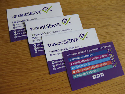
A new identity and company literature pack has recently been completed for client, tenantSERVE.

As part of an overall review of its visual image and sales literature, tenantSERVE's existing identity was redrawn and refreshed, using a new font, to create a stronger and 'friendlier' brand image for the company.

An A5-size carrier wallet, containing five insert leaflets (each successive one stepped-down in depth by 20mm to allow all title header bands to be seen on opening the wallet), used a simple graphic illustration style to communicate the company's major areas of service offering. In addition, a tri-fold 1/3 A4 leaflet and new business cards completed the overall package.


Tuesday 20 October 2015

Premier Property facelift

Premier Lettings in Bingley has recently undergone a name change and update of its identity with branding design work being produced by Aldred Design.

Before


After


Wednesday 19 August 2015

Revoking The Reich

Recently published by Firewheel Books, Revoking The Reich by author Tim Wyatt is a semi-fictional account of real and imagined events set against the timeframe of the pre- and early years of the Second World War. Aldred Design created the book jacket design and the type layout for all 362 pages of text. Aldred Design also previously created the logo for Firewheel Books. The book (ISBN 978-0-9561451-2-3) is available directly through Firewheel Books.


Sunday 15 February 2015

Lowcosttaps logo

The below design was the option selected from a number of routes presented to client, Lowcosttaps, for branding its online drop shipment site for taps and associated hardware.


Thursday 20 November 2014

Bauhinia identity

A logo has been created for Bauhinia Sandbanks, a luxury holiday home on the Sandbanks peninsula, near Poole, in Dorset. A number of options were presented but the client settled on the image of the bauhinia blossom (the national flower of Hong Kong), dissolving into reflected ripples of water. The logo has been applied to stationery and a website.


Tuesday 4 March 2014

Arnavon - Helping People Grow

A new identity has recently been completed for Arnavon, an integrated urban agriculture project based in Tucson, Arizona. The logo design (the name is a translation for 'rabbit' in Hebrew) communicates elements of the agriculture programme itself by incorporating illustrations of a rabbit, hen, fish, bees, fruits and flowers within the letter forms. Initially, the logo has been used on banners to advertise the organisation at local produce fairs and farmer's markets but will eventually be included on packaging labels and will form the visual base for a new website.


Friday 15 November 2013

CI Construction identity and stationery

A new business identity and stationery set has recently been completed for specialist building company CI Construction. Produced for client Mathew Imison Associates the new branding features a strong and simple visual image and includes a visual frieze which will be utilised on other items of marketing material, vehicle liveries and signage.


Wednesday 31 July 2013

New crest for Bradford Catholic Schools

A new crest has been created by Aldred Design for the joining of two long-established and well respected Catholic schools in Bradford; St Bede's Catholic Grammar School and St Joseph's Catholic College. The new design retains certain elements from the previous two school crests but these were redrawn in a consistent style and a new colour palette of green, blue and gold introduced. The new crest will feature on the school uniform from the beginning of the 2013-14 term.

Monday 10 December 2012

Playful Foundations identity


Aldred Design has created the visual identity for new Early Years Foundation Stage consultancy Playful Foundations. A website is in development and will be unveiled in the New Year.


Thursday 4 October 2012

Energy Store moves forward

Aldred Design has recently facelifted the identity for UK Energy Store, an online company specialising in the supply and installation of energy optimisation systems for the domestic and recreational markets.

Now


Before


..........................................................................................................

In addition, a series of website header panels were also designed to promote different areas of the company's energy saving product range. 


UK Energy Store's sister company, Automated Building Controls (which offers energy consultancy, services and optimisation systems to the commercial sector) has also had a new logo designed by Aldred Design.


Sunday 2 October 2011

Ivizzit - a new information resource


ivizzit is a new online resource offering a diverse range of information on the history, architecture, culture and annual events of over 50 cities, towns and villages within the Yorkshire county region. The ivizzit website also offers a downloadable 'app' for smartphones and computers which contains guided walks around several of the major towns and villages within the counties of North, West, South and East Yorkshire. The ivizzit logo was designed for client Saville Creative Communications.

Tuesday 5 July 2011

Business Information company gets colourful look

An identity and strapline for new business information company Your-MI (Your Management Information) has recently been completed and applied across business cards and stationery. The business cards also feature a 'barcode' device printed on the reverse which, when scanned by a smartphone, transfers all the contact details from the card into the phone's address book. Clever, eh!?

A new website is currently under development.

Tuesday 28 June 2011

AFSG Identity

An identity for the Armed Forces Support Group, a charitable organisation based in Bingley has recently been completed by Aldred Design.

Monday 15 November 2010

Makeover for Nevis Computers

Nevis Computers Ltd recently commissioned Aldred Design to refresh the company's visual identity whilst still retaining the main elements of its recognised mountain icon and text style. The new design features a redrawn mountain icon with modified logo text underneath and the whole contained within a neat roundel. The new design has been applied to business cards and a company folder which use metallic silver ink and feature a die-cut radiused corner to create a smart and professional image.


Monday 4 October 2010

Brochure pack for Australian Shopfitters

Recently completed for Melbourne client 20m is a corporate brochure, project case studies and presentation folder for Australian shopfitting company Whytehall Services. Making prominent use of on-site location photography by 20m the pack consists of a 12-page A4 landscape brochure and 16 A4 project case studies held in a carrier folder. All design, copywriting and artwork is by Aldred Design. Whytehall has offices in Melbourne, Sydney and Queensland and has clients including Telstra, Bankwest and Mothercare. Earlier this year, also working with client 20m, Aldred Design created the new identity for Whytehall Services which has been applied to all the company's stationery and signage. A new company website will be unveiled shortly.